纯CSS3实现加载Loading动画效果
以前传统使用loading的方法是一个gif动画小图片,但是扩展性不强,有时还会有锯齿。在越来越多的浏览器都支持css3时,尤其是在智能手机体验时,css3动画的loading加载动画效果就非常赞了。
今天发现几款非常漂亮的css3代码来实现的loading加载动画效果,都是非常非常值得收藏的。以后项目用的时候,直接就可以用了。

纯CSS3实现加载Loading动画效果 DEMO
运行代码<!DOCTYPE html PUBLIC "-//W3C//DTD XHTML 1.0 Transitional//EN" "http://www.w3.org/TR/xhtml1/DTD/xhtml1-transitional.dtd">
<html xmlns="http://www.w3.org/1999/xhtml">
<head>
<meta http-equiv="Content-Type" content="text/html; charset=utf-8" />
<title>纯CSS3实现8款Loading加载动画特效_web前端资源网 - www.tonjay.com</title>
</head>
<body>
<style>
.tonjay_com1 { margin: 100px auto; height: 60px; text-align: center; font-size: 10px; }
.tonjay_com1 > div { background-color: #67CF22; height: 100%; width: 6px; display: inline-block; -webkit-animation: stretchdelay 1.2s infinite ease-in-out; animation: stretchdelay 1.2s infinite ease-in-out; }
.tonjay_com1 .rect2 { -webkit-animation-delay: -1.1s; animation-delay: -1.1s; }
.tonjay_com1 .rect3 { -webkit-animation-delay: -1.0s; animation-delay: -1.0s; }
.tonjay_com1 .rect4 { -webkit-animation-delay: -0.9s; animation-delay: -0.9s; }
.tonjay_com1 .rect5 { -webkit-animation-delay: -0.8s; animation-delay: -0.8s; }
@-webkit-keyframes stretchdelay { 0%, 40%, 100% {
-webkit-transform: scaleY(0.4)
}
20% {
-webkit-transform: scaleY(1.0)
}
}
@keyframes stretchdelay { 0%, 40%, 100% {
transform: scaleY(0.4);
-webkit-transform: scaleY(0.4);
}
20% {
transform: scaleY(1.0);
-webkit-transform: scaleY(1.0);
}
}
.tonjay_com2 { width: 60px; height: 60px; background-color: #67CF22; margin: 100px auto; -webkit-animation: rotateplane 1.2s infinite ease-in-out; animation: rotateplane 1.2s infinite ease-in-out; }
@-webkit-keyframes rotateplane { 0% {
-webkit-transform: perspective(120px)
}
50% {
-webkit-transform: perspective(120px) rotateY(180deg)
}
100% {
-webkit-transform: perspective(120px) rotateY(180deg) rotateX(180deg)
}
}
@keyframes rotateplane { 0% {
transform: perspective(120px) rotateX(0deg) rotateY(0deg);
-webkit-transform: perspective(120px) rotateX(0deg) rotateY(0deg)
}
50% {
transform: perspective(120px) rotateX(-180.1deg) rotateY(0deg);
-webkit-transform: perspective(120px) rotateX(-180.1deg) rotateY(0deg)
}
100% {
transform: perspective(120px) rotateX(-180deg) rotateY(-179.9deg);
-webkit-transform: perspective(120px) rotateX(-180deg) rotateY(-179.9deg);
}
}
.tonjay_com3 { width: 60px; height: 60px; position: relative; margin: 100px auto; }
.double-bounce1, .double-bounce2 { width: 100%; height: 100%; border-radius: 50%; background-color: #67CF22; opacity: 0.6; position: absolute; top: 0; left: 0; -webkit-animation: bounce 2.0s infinite ease-in-out; animation: bounce 2.0s infinite ease-in-out; }
.double-bounce2 { -webkit-animation-delay: -1.0s; animation-delay: -1.0s; }
@-webkit-keyframes bounce { 0%, 100% {
-webkit-transform: scale(0.0)
}
50% {
-webkit-transform: scale(1.0)
}
}
@keyframes bounce { 0%, 100% {
transform: scale(0.0);
-webkit-transform: scale(0.0);
}
50% {
transform: scale(1.0);
-webkit-transform: scale(1.0);
}
}
.tonjay_com4 { margin: 100px auto; width: 32px; height: 32px; position: relative; }
.cube1, .cube2 { background-color: #67CF22; width: 30px; height: 30px; position: absolute; top: 0; left: 0; -webkit-animation: cubemove 1.8s infinite ease-in-out; animation: cubemove 1.8s infinite ease-in-out; }
.cube2 { -webkit-animation-delay: -0.9s; animation-delay: -0.9s; }
@-webkit-keyframes cubemove { 25% {
-webkit-transform: translateX(42px) rotate(-90deg) scale(0.5)
}
50% {
-webkit-transform: translateX(42px) translateY(42px) rotate(-180deg)
}
75% {
-webkit-transform: translateX(0px) translateY(42px) rotate(-270deg) scale(0.5)
}
100% {
-webkit-transform: rotate(-360deg)
}
}
@keyframes cubemove { 25% {
transform: translateX(42px) rotate(-90deg) scale(0.5);
-webkit-transform: translateX(42px) rotate(-90deg) scale(0.5);
}
50% {
transform: translateX(42px) translateY(42px) rotate(-179deg);
-webkit-transform: translateX(42px) translateY(42px) rotate(-179deg);
}
50.1% {
transform: translateX(42px) translateY(42px) rotate(-180deg);
-webkit-transform: translateX(42px) translateY(42px) rotate(-180deg);
}
75% {
transform: translateX(0px) translateY(42px) rotate(-270deg) scale(0.5);
-webkit-transform: translateX(0px) translateY(42px) rotate(-270deg) scale(0.5);
}
100% {
transform: rotate(-360deg);
/* web前端资源网 www.dyulu.com */
-webkit-transform: rotate(-360deg);
}
}
.tonjay_com5 { margin: 100px auto; width: 90px; height: 90px; position: relative; text-align: center; -webkit-animation: rotate 2.0s infinite linear; animation: rotate 2.0s infinite linear; }
.dot1, .dot2 { width: 60%; height: 60%; display: inline-block; position: absolute; top: 0; background-color: #67CF22; border-radius: 100%; -webkit-animation: bounce 2.0s infinite ease-in-out; animation: bounce 2.0s infinite ease-in-out; }
.dot2 { top: auto; bottom: 0px; -webkit-animation-delay: -1.0s; animation-delay: -1.0s; }
@-webkit-keyframes rotate { 100% {
-webkit-transform: rotate(360deg)
}
}
@keyframes rotate { 100% {
transform: rotate(360deg);
-webkit-transform: rotate(360deg)
}
}
@-webkit-keyframes bounce { 0%, 100% {
-webkit-transform: scale(0.0)
}
50% {
-webkit-transform: scale(1.0)
}
}
@keyframes bounce { 0%, 100% {
transform: scale(0.0);
-webkit-transform: scale(0.0);
}
50% {
transform: scale(1.0);
-webkit-transform: scale(1.0);
}
}
.tonjay_com6 { margin: 100px auto 0; width: 150px; text-align: center; }
.tonjay_com6 > div { width: 30px; height: 30px; background-color: #67CF22; border-radius: 100%; display: inline-block; -webkit-animation: bouncedelay 1.4s infinite ease-in-out; animation: bouncedelay 1.4s infinite ease-in-out; /* Prevent first frame from flickering when animation starts */
-webkit-animation-fill-mode: both; animation-fill-mode: both; }
.tonjay_com6 .bounce1 { -webkit-animation-delay: -0.32s; animation-delay: -0.32s; }
.tonjay_com6 .bounce2 { -webkit-animation-delay: -0.16s; animation-delay: -0.16s; }
@-webkit-keyframes bouncedelay { 0%, 80%, 100% {
-webkit-transform: scale(0.0)
}
40% {
-webkit-transform: scale(1.0)
}
}
@keyframes bouncedelay { 0%, 80%, 100% {
transform: scale(0.0);
-webkit-transform: scale(0.0);
}
40% {
transform: scale(1.0);
-webkit-transform: scale(1.0);
}
}
.tonjay_com7 { width: 40px; height: 40px; margin: 100px auto; background-color: #333; border-radius: 100%; -webkit-animation: scaleout 1.0s infinite ease-in-out; animation: scaleout 1.0s infinite ease-in-out; }
@-webkit-keyframes scaleout { 0% {
-webkit-transform: scale(0.0)
}
100% {
-webkit-transform: scale(1.0);
opacity: 0;
}
}
@keyframes scaleout { 0% {
transform: scale(0.0);
-webkit-transform: scale(0.0);
}
100% {
transform: scale(1.0);
-webkit-transform: scale(1.0);
opacity: 0;
}
}
.tonjay_com8 { margin: 100px auto; width: 20px; height: 20px; position: relative; }
.container1 > div, .container2 > div, .container3 > div { width: 6px; height: 6px; background-color: #333; border-radius: 100%; position: absolute; -webkit-animation: bouncedelay 1.2s infinite ease-in-out; animation: bouncedelay 1.2s infinite ease-in-out; -webkit-animation-fill-mode: both; animation-fill-mode: both; }
.tonjay_com8 .tonjay_com8-container { position: absolute; width: 100%; height: 100%; }
.container2 { -webkit-transform: rotateZ(45deg); transform: rotateZ(45deg); }
.container3 { -webkit-transform: rotateZ(90deg); transform: rotateZ(90deg); }
.circle1 { top: 0; left: 0; }
.circle2 { top: 0; right: 0; }
.circle3 { right: 0; bottom: 0; }
.circle4 { left: 0; bottom: 0; }
.container2 .circle1 { -webkit-animation-delay: -1.1s; animation-delay: -1.1s; }
.container3 .circle1 { -webkit-animation-delay: -1.0s; animation-delay: -1.0s; }
.container1 .circle2 { -webkit-animation-delay: -0.9s; animation-delay: -0.9s; }
.container2 .circle2 { -webkit-animation-delay: -0.8s; animation-delay: -0.8s; }
.container3 .circle2 { -webkit-animation-delay: -0.7s; animation-delay: -0.7s; }
.container1 .circle3 { -webkit-animation-delay: -0.6s; animation-delay: -0.6s; }
.container2 .circle3 { -webkit-animation-delay: -0.5s; animation-delay: -0.5s; }
.container3 .circle3 { -webkit-animation-delay: -0.4s; animation-delay: -0.4s; }
.container1 .circle4 { -webkit-animation-delay: -0.3s; animation-delay: -0.3s; }
.container2 .circle4 { -webkit-animation-delay: -0.2s; animation-delay: -0.2s; }
.container3 .circle4 { -webkit-animation-delay: -0.1s; animation-delay: -0.1s; }
@-webkit-keyframes bouncedelay { 0%, 80%, 100% {
-webkit-transform: scale(0.0)
}
40% {
-webkit-transform: scale(1.0)
}
}
@keyframes bouncedelay { 0%, 80%, 100% {
transform: scale(0.0);
-webkit-transform: scale(0.0);
}
40% {
transform: scale(1.0);
-webkit-transform: scale(1.0);
}
}
</style>
<div class="tonjay_com1">
<div class="rect1"></div>
<div class="rect2"></div>
<div class="rect3"></div>
<div class="rect4"></div>
<div class="rect5"></div>
</div>
<div class="tonjay_com2"></div>
<div class="tonjay_com3">
<div class="double-bounce1"></div>
<div class="double-bounce2"></div>
</div>
<div class="tonjay_com4">
<div class="cube1"></div>
<div class="cube2"></div>
</div>
<div class="tonjay_com5">
<div class="dot1"></div>
<div class="dot2"></div>
</div>
<div class="tonjay_com6">
<div class="bounce1"></div>
<div class="bounce2"></div>
<div class="bounce3"></div>
</div>
<div class="tonjay_com7"></div>
<div class="tonjay_com8">
<div class="tonjay_com8-container container1">
<div class="circle1"></div>
<div class="circle2"></div>
<div class="circle3"></div>
<div class="circle4"></div>
</div>
<div class="tonjay_com8-container container2">
<div class="circle1"></div>
<div class="circle2"></div>
<div class="circle3"></div>
<div class="circle4"></div>
</div>
<div class="tonjay_com8-container container3">
<div class="circle1"></div>
<div class="circle2"></div>
<div class="circle3"></div>
<div class="circle4"></div>
</div>
</div>
</body>
</html>
相关内容
-
css3按钮效果_超酷的css3按钮鼠标经过特效
今天分享一个超酷的css3按钮鼠标经过特效,相信对大家对css3的学习和理解会有不小的帮助。具体请查看以下示例:aihongxin.combody{text-align:cen...
-
移动端菜单按钮打开关闭css3小图标动画
移动端菜单按钮打开关闭css3小图标动画,保存以便备用移动端菜单按钮打开关闭css3小图标动画body,html{height:100%;display:flex;justif...
-
纯css3实现rate评分组件
纯Css3实现的rate评分组件,应该能适配所有平台的高级浏览吧。原理上较为简单,理解起来也不难。整体思路上主要是对于Css3的选择器+~:checked的灵活应用,为了方便基...
-
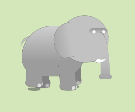
纯CSS3实现一只向前走路的大象
这一次要给大家介绍的是一款纯CSS3实现的大象走路动画,大象走路时的形态表现的十分逼真,你可能不会想到,这么给力的动画居然是用纯CSS3实现的,很可爱的大象,有空可以研究一下,...
-
文字跳动出现的一个小动画
很久之前做的一个文字跳动出现的小效果,使用了js和css3动画共同完成,作一下备份直接点击下图进行预览即可。字符跳动出现www.tonjay.com*{margin:0;pad...

-
css3禁止选中文本
通常大家会有js来实现,另一个方案就是,将-webkit-user-select和-moz-user-select的值设为none,这针对于移动用户,可能会很有用。请谨慎使用这...
-
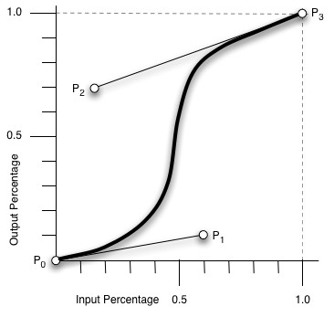
css3动画animation-timing-function中的cubic-bezier(n,n,n,n)参数详解
cubic-bezier即为贝塞尔曲线中的绘制方法。图上有四点,P0-3,其中P0、P3是默认的点,对应了[0,0],[1,1]。而剩下的P1、P2两点则是我们通过cubic-...
-
CSS3嵌入字体@font-face调用字体
@font-face可以实现从服务器端加载字体,所有浏览器中使用的字体就可以不受本地字体的限制。@font-face真的不是什么新鲜玩意,早在2001年时就被提出来,只不过近两...
-
BonBon-使用CSS3制作甜美的糖果按钮
BonBon是一组使用CSS3制作的甜美的糖果按钮样式。在过去,我们都是使用图片或者JavaScript来实现漂亮的按钮效果,随着越来越多的浏览器对CSS3的支持和完善,使用C...

-
iOS唤起键盘页面被顶上去且无法自动回退带来的问题及解决方案
iOS唤起键盘页面被顶上去且无法自动回退带来的问题及解决方案methods:{//ios端输入框弹起后自动回弹kickBack(){setTimeout(()=>{window...