CSS3卡通人物弹跳动画
纯CSS3制作的一直在弹跳的卡通人物,效果非常逼真。大家可以学习一下
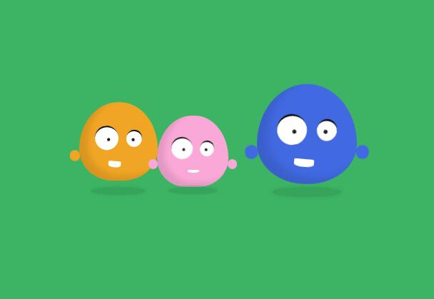
点击下面的运行,来欣赏一下
运行代码
<!doctype html>
<html lang="zh">
<head>
<meta charset="UTF-8">
<meta http-equiv="X-UA-Compatible" content="IE=edge,chrome=1">
<meta name="viewport" content="width=device-width, initial-scale=1.0">
<title>CSS3卡通人物弹跳动画DEMO演示</title>
</head>
<body>
<style>
body {
  background: #3cb464;
}
.container {
  position: absolute;
  width: 800px;
  height: 400px;
  top: 20%;
  left: 50%;
  transform: translate(-50%, -50%);
}
.container div, .container span {
  position: absolute;
}
.item {
  width: 200px;
  height: 200px;
  bottom: 70px;
  left: 50%;
  margin-left: -50px;
  -webkit-transform-origin: center bottom;
  transform-origin: center bottom;
}
.item .chewing {
  width: 100px;
  height: 100px;
  bottom: 0;
  left: 50%;
  margin-left: -50px;
  box-shadow: inset 10px -6px 10px rgba(0, 0, 0, 0.1);
  border-radius: 50% 50% 50% 50%/60% 60% 40% 40%;
  -webkit-animation: bounce 0.6s ease-in-out infinite;
  animation: bounce 0.6s ease-in-out infinite;
}
.item .chewing .eye {
  background: #fff;
  border-radius: 50%;
  border-top: 2px solid #111;
}
.item .chewing .eye span {
  width: 4px;
  height: 4px;
  background: #232323;
  border-radius: 2px;
}
.item .chewing .eye.left {
  top: 30px;
  left: 20px;
  width: 30px;
  height: 29px;
  -webkit-transform: rotate(-10deg);
  transform: rotate(-10deg);
}
.item .chewing .eye.left span {
  top: 14px;
  left: 15px;
}
.item .chewing .eye.right {
  top: 35px;
  right: 20px;
  width: 20px;
  height: 20px;
  -webkit-transform: rotate(10deg);
  transform: rotate(10deg);
}
.item .chewing .eye.right span {
  top: 9px;
  left: 7px;
}
.item .chewing .mounth {
  width: 16px;
  height: 4px;
  bottom: 20px;
  background: #fff;
  border-radius: 50% 50% 100% 100%;
}
.item .chewing .arm {
  width: 15px;
  height: 16px;
  bottom: 28px;
  border-radius: 7px;
  z-index: -1;
  -webkit-animation: arm-bounce 0.7s ease-in infinite;
  animation: arm-bounce 0.7s ease-in infinite;
}
.item .chewing .arm.left {
  left: -13px;
  -webkit-transform: rotate(-20deg);
  transform: rotate(-20deg);
}
.item .chewing .arm.right {
  right: -13px;
  -webkit-transform: rotate(20deg);
  transform: rotate(20deg);
}
.item .shadow {
  width: 70px;
  height: 10px;
  bottom: -10px;
  left: 0;
  right: 0;
  margin: auto;
  border-radius: 50%;
  background: #37a45b;
  box-shadow: 0 0 5px #37a45b;
  -webkit-animation: shadow 0.7s ease-in-out infinite;
  animation: shadow 0.7s ease-in-out infinite;
  -webkit-animation-delay: 0.3s;
  animation-delay: 0.3s;
}
.item#pink {
  left: 44%;
  z-index: 30;
}
.item#pink .chewing {
  background: #faa8d7;
}
.item#pink .mounth {
  left: 43px;
}
.item#pink .arm {
  background: #faa8d7;
}
.item#orange {
  left: 31%;
  z-index: 20;
  -webkit-transform: scale(1.1);
  transform: scale(1.1);
}
.item#orange .chewing {
  background: #f0a524;
  -webkit-animation-delay: 0.2s;
  animation-delay: 0.2s;
}
.item#orange .mounth {
  left: 37px;
  -webkit-transform: rotate(5deg);
  transform: rotate(5deg);
  -webkit-animation: mounth 0.7s ease-in-out infinite;
  animation: mounth 0.7s ease-in-out infinite;
}
.item#orange .arm {
  background: #f0a524;
}
.item#blue {
  left: 64%;
  z-index: 20;
  -webkit-transform: scale(1.4);
  transform: scale(1.4);
}
.item#blue .chewing {
  background: royalblue;
  -webkit-animation-delay: 0.4s;
  animation-delay: 0.4s;
}
.item#blue .mounth {
  left: 37px;
  width: 20px;
  height: 5px;
  -webkit-transform: rotate(5deg);
  transform: rotate(5deg);
  -webkit-animation: mounth 0.7s ease-in-out infinite;
  animation: mounth 0.7s ease-in-out infinite;
}
.item#blue .arm {
  background: royalblue;
}
@keyframes bounce {
  0% {
    bottom: 0;
  }
  65% {
    bottom: 8px;
  }
  100% {
    bottom: 0;
    border-radius: 49% 47% 42% 40%/60% 60% 40% 40%;
  }
}
@keyframes arm-bounce {
  0%, 100% {
    bottom: 28px;
  }
  33% {
    bottom: 23px;
  }
  40% {
    -webkit-transform: scale(0.8);
    transform: scale(0.8);
  }
  66% {
    -webkit-transform: scale(1);
    transform: scale(1);
  }
}
@keyframes shadow {
  0%, 100% {
    -webkit-transform: scaleX(1);
    transform: scaleX(1);
  }
  50% {
    -webkit-transform: scaleX(0.9);
    transform: scaleX(0.9);
  }
}
@keyframes mounth {
  0%, 100% {
    height: 4px;
    border-radius: 50% 50% 100% 100%;
  }
  50% {
    height: 8px;
    bottom: 17px;
    border-radius: 30% 30% 100% 100%;
  }
}
</style>
<div class="container">
	<div class="item" id="pink">
		<div class="chewing">
			<div class="eye left"><span></span></div>
			<div class="eye right"><span></span></div>
			<div class="mounth"></div>
				<div class="arm left"></div>
				<div class="arm right"></div>
			</div>
			<div class="shadow"></div>
		</div>
	<div class="item" id="orange">
		<div class="chewing">
			<div class="eye left"><span></span></div>
			<div class="eye right"><span></span></div>
			<div class="mounth"></div>
			<div class="arm left"></div>
			<div class="arm right"></div>
		</div>
		<div class="shadow"></div>
	</div>
	<div class="item" id="blue">
		<div class="chewing">
			<div class="eye left"><span></span></div>
			<div class="eye right"><span></span></div>
			<div class="mounth"></div>
			<div class="arm left"></div>
			<div class="arm right"></div>
		</div>
		<div class="shadow"></div>
	</div>
</div>
</body>
</html>
相关内容
-
为什么grid-gap会导致溢出?
您有一个3列网格容器(.body):grid-template-columns:25%50%25%这些列的总宽度为100%。然后在列(和行)之间添加沟槽:grid-gap:10...
-
css3给背景图层加颜色遮罩的方法
(学习视频分享:css视频教程)在开发中,有时遇到需要给背景层加颜色遮罩的项目,现在特定总结一下给背景图层加颜色遮罩的方法。方法一:通过定位叠加(注意层级)<divcla...

-
使用CSS实现的几种进度条
(学习视频分享:css视频教程)进度条是一个非常常见的功能,实现起来也不难,一般我们都会用div来实现。作为一个这么常见的需求,whatwg肯定是不会没有原生组件提供(虽然有我...

-
CSS3实现文字折纸效果的方法(代码示例)
本篇文章给大家通过示例介绍一下使用CSS3来实现文字折纸效果的方法,有着一定的参考价值,现在分享给大家,有需要的朋友可以参考一下,希望对大家有所帮助。CSS3文字折纸代码如下,...

-
css3字体可以模糊吗
css3字体的可以模糊的;开发者可以使用CSS3中的filter属性来实现字体模糊效果,filter语法是“filter:blur(px);”,其filter属性定义了元素的可...

-
vs2010 如何支持css3
vs2010支持css3的方法:首先下载CSS3IntellisenseSchema并安装;然后用“Win+R”输入“regedit”打开注册表;接着将css30.xml拷贝到...
-
聊聊你可能不了解的CSS属性函数 attr()
本篇文章带大家了解一下CSS属性函数attr()。有一定的参考价值,有需要的朋友可以参考一下,希望对大家有所帮助。属性函数attr()用于获取HTML元素里面的属性值,并用于样...
-
浅谈css3 device-width和width之间的差异
本篇文章和大家谈谈css媒体查询中device-width与width的区别。有一定的参考价值,有需要的朋友可以参考一下,希望对大家有所帮助。【推荐教程:CSS视频教程】1.d...
-
css3怎么设置元素背面不可见
在css3中,可以利用backface-visibility属性,通过给元素添加“backface-visibility:hidden;”样式来设置背面不可见。backface...

-
详细了解CSS3中的border-image-slice属性
【推荐教程:CSS视频教程】首先我们来了解一下它是干嘛的。说明:文档说明:它是控制图像边界向内偏移的。what???这是嘛意思啊?根本看不懂!!!好的,我们先不要急,我们在看看...