一文通过动画来快速学习 css !
本篇文章带大家深入解析一下如何实现动画效果,通过动画来快速学习 css ,希望对大家有所帮助!
随着业务对前端的需求越来越多,作为前端三大法宝之一的css也越变越复杂。给初学的同学们带来了一定的压力。css具体到每一个属性也都没有多复杂,主要问题在于知识点比较多。好不容易把主要知识点学完了,一看网上的题,或者是一看大师们写的css的书,又被淹没到新的海洋中。
其实人类的大脑不善于记忆零散的知识点,但是如果有一条逻辑线能够将这些知识串联起来,就能大大方便大脑的记忆和搜索。这个线索要有逻辑,最好还有趣。
刚好,css的动画就是这样一条有趣的线索,可以在动画的变化中理解css属性。
比如我们知道css增加了圆角矩形的border-radius属性,那么设置不同大小的圆角,是什么样的效果呢?与其一次次地改大小去试验,不如我们做成一个动画让其一目了然:
我们还可以让其移动位置中变形:

甚至我们还能让其转圈:
CSS动画快速扫盲
在串起其它属性之前,我们先理解下动画。
动画的核心关键词在于“动”。
我们要回答几个问题:
- What: 什么东西动?
- Where: 往哪里动?
- When: 什么时候动?动多久?
- How: 怎么动?
- How much: 动多少次?
这些问题的结果,就构成了一个动画的构成要素。
首先是动的主体是什么?就是我们的HTML标签,或者是标签构成的复杂组件之类的。对我们来说,主要就是
第二,往哪里动?这就是要变化的css属性。这也是我们想用来串起来的css的知识点。
第三,什么时候动?我们需要指定动画的时长,起始的时机等等。这是纯动画的技术属性。
第四,怎么动?是匀速动,还是加速动,还是先加速再减速,还是要搞个贝塞尔曲线之类的,这也是动画的技术属性。
第五,动多少次?是一次,还是多次,还是一直动下去?这也是纯动画的技术属性。
transition动画
我们先学习一个简单的css属性动画,叫做transition。
它就是由上面的4个属性组成的:
- transition-property: 指定要变的css属性值
- transition-duration: 动画时长
- transition-timing-function: 动画的快慢变化
- transition-delay: 动画起始的延迟时间
我们来看个例子:
        #hellocss {
            transition-property: width;
            transition-duration: 5s;
            transition-timing-function: linear;
            transition-delay: 1s;
        }
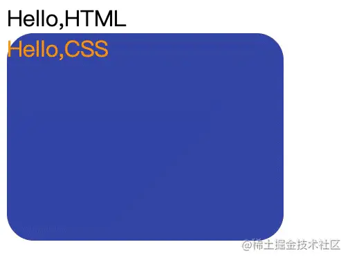
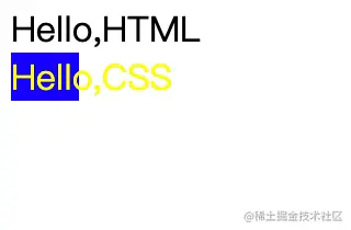
这个动画指定的意思是说,如果宽度width变化了,则延迟一秒运行5秒宽度变化的动画。变化速度是匀速的。
为了看得清楚,我们设一个初始的width,再加上一个背景色和前景色:
    <style>
        #hellocss {
            background-color: blue;
            color: yellow;
            width: 20px;
            transition-property: width;
            transition-duration: 5s;
            transition-timing-function: linear;
            transition-delay: 1s;
        }
    </style>
既然是动画,那么要有变化。
于是我们写两句javascript:
    <script>
        function trans1(){
            let hcss1 = document.getElementById("hellocss");
            hcss1.style.width = "100px";
        }
    </script>
然后找个事件来触发这个变化,比如我们在页面加载时来做:
  <body onload="trans1()">
    <div>Hello,HTML</div>
    <div id="hellocss">Hello,CSS</div>
    <script>
        function trans1(){
            let hcss1 = document.getElementById("hellocss");
            hcss1.style.width = "100px";
        }
    </script>
  </body>
完整的代码如下:
<!DOCTYPE html>
<html>
  <head>
    <meta charset="utf-8" />
    <style>
        #hellocss {
            background-color: blue;
            color: yellow;
            width: 20px;
            transition-property: width;
            transition-duration: 5s;
            transition-timing-function: linear;
            transition-delay: 1s;
        }
    </style>
  </head>
  <body onload="trans1()">
    <div>Hello,HTML</div>
    <div id="hellocss">Hello,CSS</div>
    <script>
        function trans1(){
            let hcss1 = document.getElementById("hellocss");
            hcss1.style.width = "100px";
        }
    </script>
  </body>
</html>
熟练了之后,我们也可以将4个属性简写成一个:
transition: width 5s linear 1s;
如果没有延时,第4项可以不写。
如果采用先慢后快的ease方式,第3项也可以省略。
如果第一项是什么变都动,可以写成all。
但是第二项动画时长不能不写,不写默认是0秒,就啥也没有了。
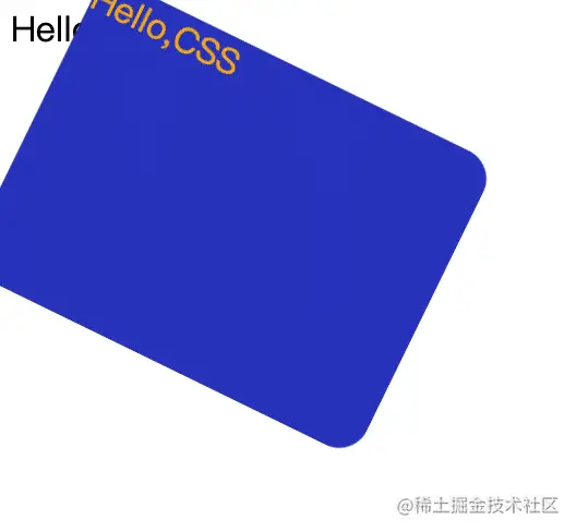
所有的可以线性计算的属性都可以用来进行动画。除了宽、高、位置等容易理解的坐标属性,颜色属性也是经常被用来做动画的好场景。
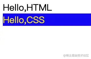
我们来看一个从蓝底黄字到白底黑字的动画过程:

<!DOCTYPE html>
<html>
  <head>
    <meta charset="utf-8" />
    <style>
        #hellocss {
            background-color: blue;
            color: yellow;
            transition: all 10s linear 1s;
        }
    </style>
  </head>
  <body onload="trans1()">
    <div>Hello,HTML</div>
    <div id="hellocss">Hello,CSS</div>
    <script>
        function trans1(){
            let hcss1 = document.getElementById("hellocss");
            hcss1.style.backgroundColor = "white";
            hcss1.style.color="red";
        }
    </script>
  </body>
</html>
keyframes动画
上面的transition比较简单,针对于比如要循环多少次,或者变过去还要再变回来,或者中间要变几次等,我们就需要指定更多的属性。这些需求就由keyframes动画来满足。
keyframes动画的好处就是起点和终点都在keyframes中指定,不用再写事件去改变了, 全部在css中完成:
        @keyframes color_change{
            from {
                background-color: blue;
                color: yellow;
            }
            to {
                background-color: white;
                color: black;
            }
        }
然后我们在一个css选择器里面去引用定义好的keyframes动画,同时指定动画时长、变化曲线和延时:
        #hellocss {
            animation-name: color_change;
            animation-duration: 10s;
            animation-timing-function: linear;
            animation-delay: 1s;
        }
到了keyframes动画,我们终于可以指定播放多少次了,比如连播三次:
        #hellocss {
            animation-name: color_change;
            animation-duration: 10s;
            animation-timing-function: linear;
            animation-delay: 1s;
            animation-iteration-count: 3;
        }
甚至可以无限性地播放下去:
animation-iteration-count: infinite;
光循环播还不过瘾,我们还想先正着变,然后再变回来,我们可以将方向设为交替播放:
animation-direction: alternate;
把上面的综合在一起,大家跑起来看看:
<!DOCTYPE html>
<html>
  <head>
    <meta charset="utf-8" />
    <style>
      @keyframes color_change {
        from {
          background-color: blue;
          color: yellow;
        }
        to {
          background-color: white;
          color: black;
        }
      }
      #hellocss {
        animation-name: color_change;
        animation-duration: 5s;
        animation-timing-function: linear;
        animation-delay: 1s;
        animation-iteration-count: infinite;
        animation-direction: alternate;
      }
    </style>
  </head>
  <body>
    <div>Hello,HTML</div>
    <div id="hellocss">Hello,CSS</div>
  </body>
</html>
而其实呢,from和to,分别是0%和100%的别名,也可以这么写:
      @keyframes color_change {
        0% {
          background-color: blue;
          color: yellow;
        }
        100% {
          background-color: white;
          color: black;
        }
      }
这样我们可以增加百分比,让变化变得更有趣一些:
      @keyframes color_change {
        0% {
          background-color: blue;
          color: yellow;
        }
        50% {
          background-color: yellowgreen;
          color: red;
        }
        100% {
          background-color: white;
          color: black;
        }
      }
最后,如果想让动画播放暂停怎么办? 我们可以通过修改animationPlayState属性为paused来实现,比如我们让点击第一个div来实现暂停功能:
  <body>
    <div onclick="trans1()">Hello,HTML</div>
    <div id="hellocss">Hello,CSS</div>
    <script>
      function trans1() {
        let hcss1 = document.getElementById("hellocss");
        hcss1.style.animationPlayState = "paused";
      }
    </script>
  </body>
通过动画形象理解css属性
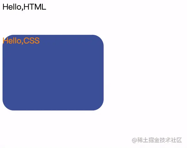
变形 - 圆角矩形

我们现在终于可以看看开篇时的第一个动画是如何写成的了:
      @keyframes color_change {
        0% {
          background-color: blue;
          color: yellow;
          border-radius: 0px;
        }
        50% {
          background-color: yellowgreen;
          color: red;
        }
        100% {
          background-color: palegoldenrod;
          color: black;
          border-radius: 100px;
        }
      }
平面移动:transform:translate属性
最简单的平移方式就是使用transform:translate属性。比如我们开篇的第二个动画:
我们先让变色的圆角矩形向下移100px,然后再右移100px:
            0% {
                background-color: blue;
                color: yellow;
                border-radius: 0px;
                transform:translate(0px,0px)
            }
            50% {
                background-color: yellowgreen;
                color: red;
                transform:translate(0px,100px)
            }
            100% {
                background-color: palegoldenrod;
                color: black;
                border-radius: 100px;
                transform:translate(100px,100px)
            }
        }
旋转:transform:rotate属性
最后我们看旋转属性。

        @keyframes color_change{
            0% {
                background-color: blue;
                color: yellow;
                border-radius: 0px;
                transform:translate(0px,0px);
                transform:rotate(0deg);
            }
            50% {
                background-color: yellowgreen;
                color: red;
                transform:translate(0px,100px);
                transform:rotate(90deg);
            }
            100% {
                background-color: palegoldenrod;
                color: black;
                border-radius: 100px;
                transform:translate(100px,100px);
                transform:rotate(180deg);
            }
        }
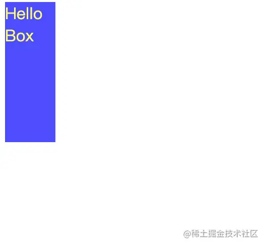
通过动画学习盒子模型
让我们回归基础,通过动画来了解盒子模型。
所谓盒子,最基础的就是宽和高。
这没啥可说的,来个宽高动画先体验一下:
<!DOCTYPE html>
<html>
  <head>
    <meta charset="utf-8" />
    <style>
        @keyframes box_change {
            0% {
                height: 50px;
                width: 50px;
            }
            50% {
                height: 200px;
                width: 50px;
            }
            100% {
                height: 200px;
                width: 200px;
            }
        }
        .box1 {
            background-color: blue;
            color: yellow;
            opacity: 0.65;
            animation-name: box_change;
            animation-duration: 10s;
            animation-delay: 1s;
            animation-timing-function: ease;
            animation-iteration-count: infinite;
            animation-direction: alternate;
        }
    </style>
  </head>
  <body>
      <div class="box1">Hello Box</div>
  </body>
</html>
除了宽高之外,盒子有边框,边框内部有padding,边框外面还有margin。
包括边框在内,都分为top, bottom, left, right四个方向:
        border-width: 5px;
        border-top-color: #f5222d;
        border-bottom-color: #cf1322;
        border-left-color: #a8071a;
        border-right-color: #820014;
        padding: 10px;
        margin: 15px;
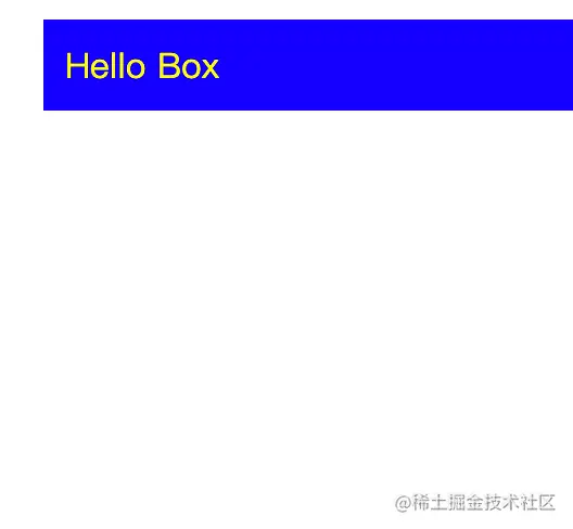
我们现在给边框加上颜色和形状,带着margin和padding动起来看看效果:

代码如下:
<!DOCTYPE html>
<html>
  <head>
    <meta charset="utf-8" />
    <style>
      @keyframes box_change {
        0% {
          height: 50px;
          width: 50px;
          border-style: solid;
        }
        50% {
          height: 200px;
          width: 50px;
          border-style: dotted;
        }
        100% {
          height: 200px;
          width: 200px;
          border-style: dashed;
        }
      }
      .box1 {
        background-color: blue;
        color: yellow;
        border-width: 5px;
        border-top-color: #f5222d;
        border-bottom-color: #cf1322;
        border-left-color: #a8071a;
        border-right-color: #820014;
        padding: 10px;
        margin: 15px;
        animation-name: box_change;
        animation-duration: 10s;
        animation-delay: 1s;
        animation-timing-function: ease;
        animation-iteration-count: infinite;
        animation-direction: alternate;
      }
    </style>
  </head>
  <body>
    <div class="box1">Hello Box</div>
  </body>
</html>
打开chrome的开发者工具,我们可以更清楚地看清content, padding, border, margin, 之间的关系:
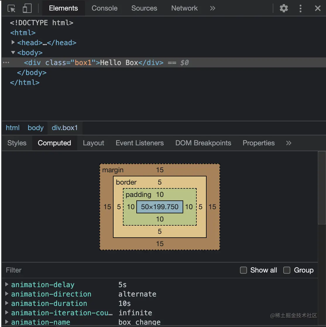
Border取5px只是为了让其更容易被识别,但是太丑了,我们将其改为2px。效果就好得多了:
(学习视频分享:css视频教程)
以上就是一文通过动画来快速学习 css !的详细内容!
相关内容
-
css实现领积分动画效果
最近项目中要做一个领积分的效果,根据老板的描述,这个效果类似于支付宝蚂蚁森林里的领取能量。整体效果是就是在树周围飘着几个积分元素,上下滑动,类似星星闪烁,点击领取后,沿着树中心...

-
利用css实现一个抽奖动画效果
首先我们先来看下最终的运行效果:从效果图我们可以看到,抽奖会自动进行,并显示中奖信息。这个效果基本是用CSS实现的,没有用图片,加一丢丢JS。完全没有考虑兼容性。具体步骤如下:...
-
利用css制作有趣的文字摆动动画特效
在之前的文章《超实用!利用CSS3将两个图片叠加在一起显示》中,我们分享了两种利用CSS3将两个图片叠加融合在一起显示的特效。这次我们给大家介绍一下利用CSS如何制作文字摆动动...

-
css怎么实现文字循环滚动效果
css实现文字循环滚动的方法:1、在文字元素上使用animation属性绑定一个循环动画;2、利用“@keyframes”规则和“transform:translateX(值%...
-
看看图片走马灯动态效果利用CSS怎么实现?
图片走马灯动态效果利用CSS怎么实现?下面本篇文章就来给大家介绍一下使用css3animationtransform实现图片走马灯效果的方法,希望对大家有所帮助!由于项目需要实...
-
利用纯CSS实现旋转React图标的动画效果
本篇文章手把手带大家利用纯CSS实现旋转React图标的动画效果,希望对大家有所帮助!几天前,小包在codepen看到一个剑气加载效果,大为惊奇,再次被CSS折服。本来想和大家...
-
css怎么实现图片放大缩小动画
方法:1、使用“@keyframes动画名称{}”规则和“transform:scale(缩放比例);”语句创建放大缩小动画;2、使用“图片元素{animation:动画名称时...
-
深入了解CSS动画新特性:@scroll-timeline
在之前的文章《2022年你值得了解的几个CSS新特性(收藏学习)》中带大家简单介绍了几个CSS新特性,今天带大家深入了解其中的一个新特性(动画杀手锏):@scroll-time...
-
手把手带你使用CSS绘制一个可爱卡通狮子动画
怎么利用CSS绘制狮子动画?下面本篇文章手把手带大家一步步利用CSS绘制一个可爱卡通狮子动画,希望对大家有所帮助。本期我们要使用纯css来绘制出一个乖巧可爱的卡通狮子,通过这个...

-
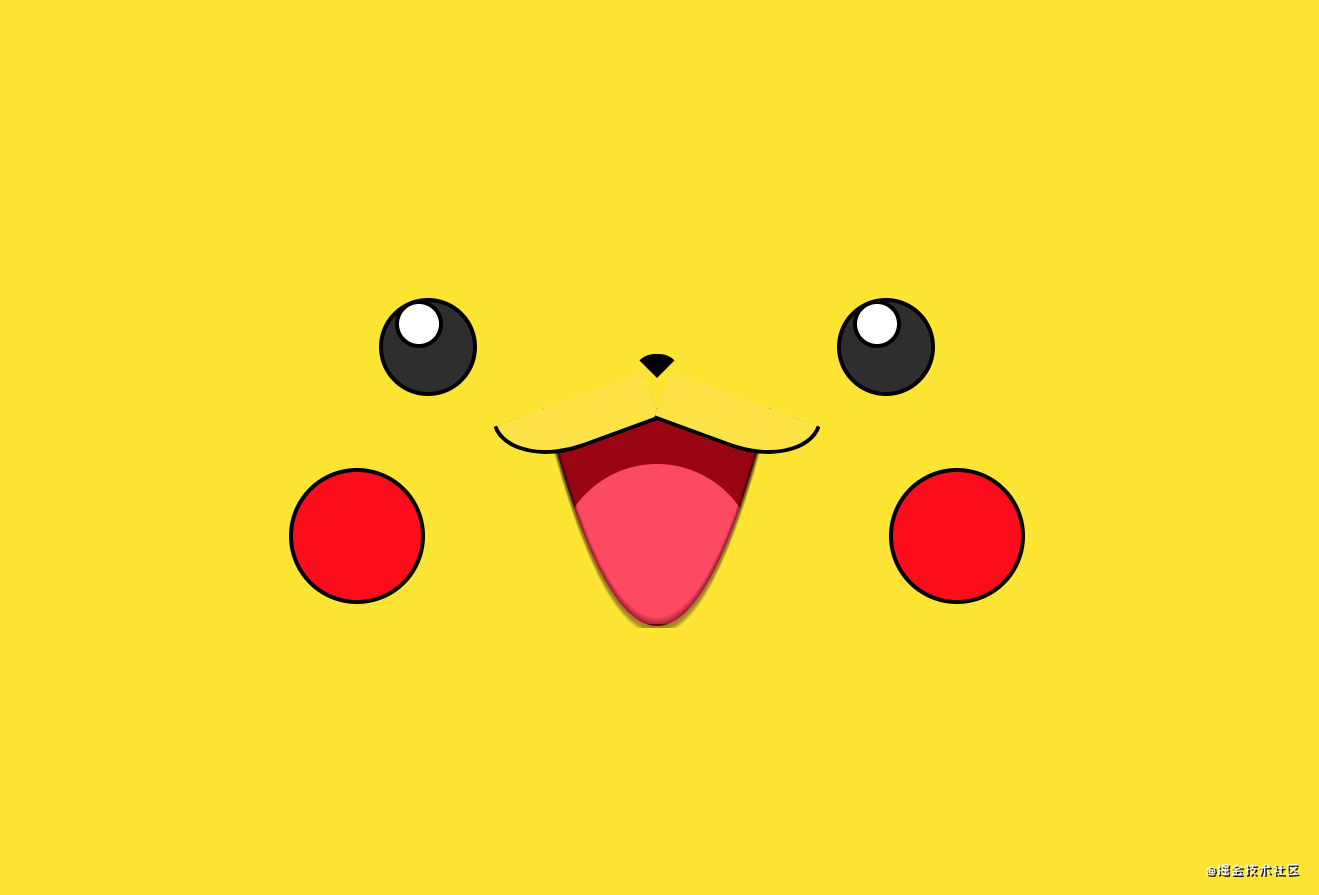
CSS+JS如何制作皮卡丘动画(代码分析)
本篇文章给大家介绍一下CSS+JavaScript制作皮卡丘动画的方法,会一步步给大家介绍使用css如何绘制皮卡丘,如何使用js实现动态效果,让皮卡丘动起来。简单记录一下思路,...