手把手教你怎么使用CSS3实现动画效果(代码分享)
之前的文章《H5篇:页面中实现动画的几种方式?(附代码)》中,带大家了解页面中实现动画的几种方式。下面本篇文章给大家介绍怎么使用CSS3来实现一个简单漂亮的动画效果,我们一起看看
复习下 css3 的动画, 都快不会写了,那会儿挺喜欢 flash 的,可惜了时代在前进。写这里就当是文档看吧
浏览器支持
Internet Explorer 10、Firefox 以及 Opera 支持 animation 属性。
Safari 和 Chrome 支持替代的 -webkit-animation 属性。
注释:Internet Explorer 9 以及更早的版本不支持 animation 属性。
定义和用法
animation属性是一个简写属性,用于设置六个动画属性:
-
animation-name
-
animation-duration
-
animation-timing-function
animation-delay -
animation-iteration-count
animation-direction
语法
animation: name duration timing-function delay iteration-count direction;
| 值 | 描述 | 备注 |
|---|---|---|
| animation-timing-function | 规定动画的速度曲线 | 可取值为 linear ,ease(淡入淡出),ease-in,ease-out ,ease-in-out,cubic-bezier(n, n, n, n) |
| animation-play-state | 规定动画是否正在运行或暂停。 | paused 表示暂停状态,running 表示运行状态 |
| animation-name | 规定需要绑定到选择器的 keyframe 名称 | @keyframe { from {opcity:0} to {opcity:1}} |
| animation-iteration-count | 规定动画应该播放的次数 | 可选值为 infinite(无限次)n(比如 5 次) |
| animation-fill-mode | 动画在播放之前或之后,其动画效果是否可见。 | none(默认) / forwards(动画完成后) / backwards(在动画显示之前) / both(两者); |
| animation-duration | 规定完成动画所花费的时间,以秒或毫秒计 | 必须规定否则,不执行动画 |
| animation-direction | 规定是否应该轮流反向播放动画 | 默认值 normal,alternate 为动画应该轮流反向播放。左右左 |
| animation-delay | 规定在动画开始之前的延迟 | 定义动画开始前等待的时间,以秒或毫秒计。默认值是 0。单位为 s |
关于keyframe的定义
-
Firefox支持替代的@-moz-keyframes规则;
-
Opera支持替代的@-o-keyframes规则;
-
Safari和Chrome支持替代的@-webkit-keyframes规则;
-
取值支持 0-100% 和from,to。
@keyframes move {
  0% {
    top: 0px;
    left: 0px;
  }
  25% {
    top: 200px;
    left: 200px;
  }
  50% {
    top: 100px;
    left: 100px;
  }
  75% {
    top: 200px;
    left: 200px;
  }

  100% {
    top: 0px;
    left: 0px;
  }
}

@keyframes move {
  from {
    top: 0px;
    left: 0px;
  }
  to {
    top: 0px;
    left: 100px;
  }
}
demo
写了一个例子,地球绕太阳转
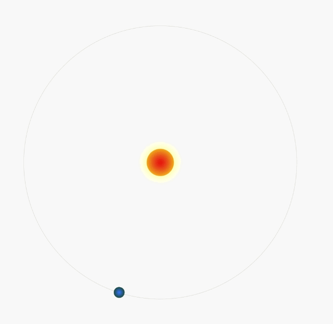
以下是代码
<!-- html 部分 -->
<div style="width:700px; ">
  <div class="t">
    <div class="t1"></div>
  </div>
</div>
/* css 部分 */
@keyframes t {
  from {
    transform: rotate(0deg);
  }
  to {
    transform: rotate(360deg);
  }
}

@-webkit-keyframes t {
  from {
    transform: rotate(0deg);
  }
  to {
    transform: rotate(360deg);
  }
}

.t {
  height: 500px;
  width: 500px;
  position: relative;
  border-radius: 50%;
  transform: scale(.8);
  border: 1px solid #dedede;
  &::before {
    content: "";
    width: 50px;
    height: 50px;
    background: radial-gradient(72px, #f00, #ff0, #080);
    border-radius: 50%;
    position: absolute;
    left: 50%;
    top: 50%;
    margin-top: -25px;
    margin-left: -25px;
    box-shadow: 0 0 37px #fcff4a;
  }
  .t1 {
    height: 20px;
    border-radius: 50%;
    width: 20px;
    margin-top: -10px;
    top: 50%;
    left: -10px;
    background: radial-gradient(26px, #0082ff, #184608, #003ade);
    position: absolute;
    animation: t 3s infinite linear;
    transform-origin: 260px center;
  }
}

</style>
还有一个 demo ,在这里https://k-ui.cn
推荐学习CSS3视频教程
以上就是手把手教你怎么使用CSS3实现动画效果(代码分享)的详细内容!
相关内容
-
为什么grid-gap会导致溢出?
您有一个3列网格容器(.body):grid-template-columns:25%50%25%这些列的总宽度为100%。然后在列(和行)之间添加沟槽:grid-gap:10...
-
css3给背景图层加颜色遮罩的方法
(学习视频分享:css视频教程)在开发中,有时遇到需要给背景层加颜色遮罩的项目,现在特定总结一下给背景图层加颜色遮罩的方法。方法一:通过定位叠加(注意层级)<divcla...

-
使用CSS实现的几种进度条
(学习视频分享:css视频教程)进度条是一个非常常见的功能,实现起来也不难,一般我们都会用div来实现。作为一个这么常见的需求,whatwg肯定是不会没有原生组件提供(虽然有我...

-
CSS3实现文字折纸效果的方法(代码示例)
本篇文章给大家通过示例介绍一下使用CSS3来实现文字折纸效果的方法,有着一定的参考价值,现在分享给大家,有需要的朋友可以参考一下,希望对大家有所帮助。CSS3文字折纸代码如下,...

-
css3字体可以模糊吗
css3字体的可以模糊的;开发者可以使用CSS3中的filter属性来实现字体模糊效果,filter语法是“filter:blur(px);”,其filter属性定义了元素的可...

-
vs2010 如何支持css3
vs2010支持css3的方法:首先下载CSS3IntellisenseSchema并安装;然后用“Win+R”输入“regedit”打开注册表;接着将css30.xml拷贝到...
-
聊聊你可能不了解的CSS属性函数 attr()
本篇文章带大家了解一下CSS属性函数attr()。有一定的参考价值,有需要的朋友可以参考一下,希望对大家有所帮助。属性函数attr()用于获取HTML元素里面的属性值,并用于样...

-
浅谈css3 device-width和width之间的差异
本篇文章和大家谈谈css媒体查询中device-width与width的区别。有一定的参考价值,有需要的朋友可以参考一下,希望对大家有所帮助。【推荐教程:CSS视频教程】1.d...
-
css3怎么设置元素背面不可见
在css3中,可以利用backface-visibility属性,通过给元素添加“backface-visibility:hidden;”样式来设置背面不可见。backface...

-
详细了解CSS3中的border-image-slice属性
【推荐教程:CSS视频教程】首先我们来了解一下它是干嘛的。说明:文档说明:它是控制图像边界向内偏移的。what???这是嘛意思啊?根本看不懂!!!好的,我们先不要急,我们在看看...