css bfc是什么意思
在css中,bfc中文意思为“块级格式化上下文”,是Web页面中盒模型布局的CSS渲染模式,指一个独立的渲染区域或者说是一个隔离的独立容器。块格式化上下文包含创建它的元素内部的所有内容。

本教程操作环境:windows7系统、CSS3&&HTML5版、Dell G3电脑。
何为BFC
BFC(Block Formatting Context)块级格式化上下文,是Web页面中盒模型布局的CSS渲染模式,指一个独立的渲染区域或者说是一个隔离的独立容器。
BFC 即 Block Formatting Contexts (块级格式化上下文),属于普通流。
可以把 BFC 理解为一个封闭的大箱子,箱子内部的元素无论如何翻江倒海,都不会影响到外部。
形成BFC的条件
1、浮动元素,float 除 none 以外的值;
2、绝对定位元素,position(absolute,fixed);
3、display 为以下其中之一的值 inline-block,table-cell,table-caption、flex;
4、overflow 除了 visible 以外的值(hidden,auto,scroll);
5、body 根元素
BFC的特性
1.内部的Box会在垂直方向上一个接一个的放置。
2.垂直方向上的距离由margin决定
3.bfc的区域不会与float的元素区域重叠。
4.计算bfc的高度时,浮动元素也参与计算
5.bfc就是页面上的一个独立容器,容器里面的子元素不会影响外面元素。
实践是检验真理的唯一标准
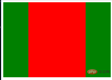
(1)BFC中的盒子对齐
特性的第一条是:内部的Box会在垂直方向上一个接一个的放置。
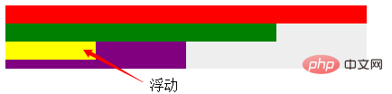
浮动的元素也是这样,box3浮动,他依然接着上一个盒子垂直排列。并且所有的盒子都左对齐。
html:
<div class="container">
        <div class="box1"></div>
        <div class="box2"></div>
        <div class="box3"></div>
        <div class="box4"></div>
    </div>
div {
            height: 20px;
        }

        .container {
            position: absolute;  /* 创建一个BFC环境*/
            height: auto;
            background-color: #eee;
        }

        .box1 {
            width: 400px;
            background-color: red;
        }

        .box2 {
            width: 300px;
            background-color: green;
        }

        .box3 {
            width: 100px;
            background-color: yellow;
            float: left;
        }

        .box4 {
            width: 200px;
            height: 30px;
            background-color: purple;
        }
(2)外边距折叠
特性的第二条:垂直方向上的距离由margin决定
在常规文档流中,两个兄弟盒子之间的垂直距离是由他们的外边距所决定的,但不是他们的两个外边距之和,而是以较大的为准。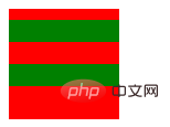
html:
 <div class="container">
        <div class="box"></div>
        <div class="box"></div>
    </div>
.container {
            overflow: hidden;
            width: 100px;
            height: 100px;
            background-color: red;
        }

        .box1 {
            height: 20px;
            margin: 10px 0;
            background-color: green;
        }

        .box2 {
            height: 20px;
            margin: 20px 0;
            background-color: green;
        }
这里我门可以看到,第一个子盒子有上边距(不会发生margin穿透的问题);两个子盒子的垂直距离为20px而不是30px,因为垂直外边距会折叠,间距以较大的为准。
那么有没有方法让垂直外边距不折叠呢?答案是:有。特性的第5条就说了:bfc就是页面上的一个独立容器,容器里面的子元素不会影响外面元素,同样外面的元素不会影响到BFC内的元素。所以就让box1或box2再处于另一个BFC中就行了。
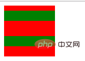
<div class="container">
        <div class="wrapper">
            <div class="box1"></div>
        </div>
        <div class="box2"></div>
    </div>
.container {
        overflow: hidden;
        width: 100px;
        height: 100px;
        background-color: red;
    }

    .wrapper {
        overflow: hidden;
    }

    .box1 {
        height: 20px;
        margin: 10px 0;
        background-color: green;
    }

    .box2 {
        height: 20px;
        margin: 20px 0;
        background-color: green;
    }
(3)不被浮动元素覆盖
以常见的两栏布局为例。
左边固定宽度,右边不设宽,因此右边的宽度自适应,随浏览器窗口大小的变化而变化。
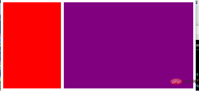
html:
<div class="column"></div>
<div class="column"></div>
 .column:nth-of-type(1) {
            float: left;
            width: 200px;
            height: 300px;
            margin-right: 10px;
            background-color: red;
        }

        .column:nth-of-type(2) {
            overflow: hidden;/*创建bfc */
            height: 300px;
            background-color: purple;
        }
还有三栏布局。
左右两边固定宽度,中间不设宽,因此中间的宽度自适应,随浏览器的大小变化而变化。
html:
  <div class="contain">
        <div class="column"></div>
        <div class="column"></div>
        <div class="column"></div>
    </div>
.column:nth-of-type(1),
        .column:nth-of-type(2) {
            float: left;
            width: 100px;
            height: 300px;
            background-color: green;
        }

        .column:nth-of-type(2) {
            float: right;
        }

        .column:nth-of-type(3) {
            overflow: hidden;  /*创建bfc*/
            height: 300px;
            background-color: red;
        }
也可以用来防止字体环绕:
众所周知,浮动的盒子会遮盖下面的盒子,但是下面盒子里的文字是不会被遮盖的,文字反而还会环绕浮动的盒子。这也是一个比较有趣的特性。
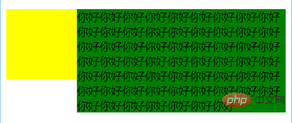
html:
 <div class="left"></div>
    <p>你好你好你好你好你好你好你好你好你好你好你好你好你好你好你好你好你好你好你好
       你好你好你好你好你好你好你好你好你好你好你好你好你好你好你好你好你好你好你好
       你好你好你好你好你好你好你好你好你好你好你好你好你好你好你好你好你好你好你好你好你好你好你好
    </p>
css:
(1)环绕
   .left {
            float: left;
            width: 100px;
            height: 100px;
            background-color: yellow;
        }

        p {
            background-color: green;            /* overflow: hidden; */
        }
(2)利用bfc防止环绕
   .left {
            float: left;
            width: 100px;
            height: 100px;
            background-color: yellow;
        }

        p {
            background-color: green;
            overflow: hidden;
        }
(4)BFC包含浮动的块
这个是大家再熟悉不过的了,利用overflow:hidden清除浮动嘛,因为浮动的盒子无法撑出处于标准文档流的父盒子的height。这个就不过多解释了,相信大家都早已理解。
⑵ BFC可以包含浮动的元素(清除浮动)
浮动的元素会脱离普通文档流,来看下下面一个例子:
<div style="border: 1px solid #000;">
    <div style="width: 100px;height: 100px;background: #eee;float: left;"></div>
</div>
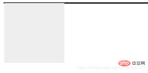
由于容器内元素浮动脱离文档流,导致容器只剩下2px边距高度,我们这时候可以采用BFC:
<div style="border: 1px solid #000;overflow: hidden">
    <div style="width: 100px;height: 100px;background: #eee;float: left;"></div>
</div>
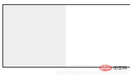
⑶ 可以阻止元素被浮动元素覆盖
先看一个文字环绕效果:
<div style="height: 100px;width: 100px;float: left;background: lightblue">我是一个左浮动的元素</div>
<div style="width: 200px; height: 200px;background: #eee">我是一个没有设置浮动,
也没有触发 BFC 元素, width: 200px; height:200px; background: #eee;</div>
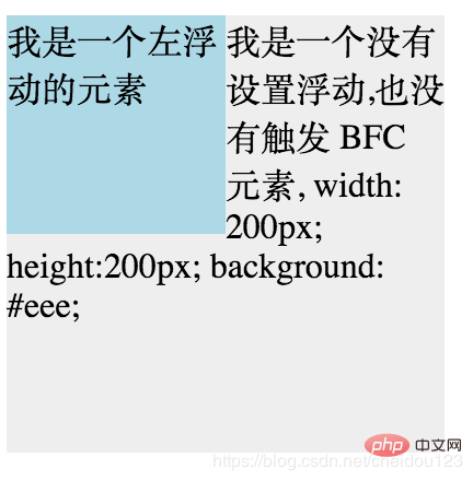
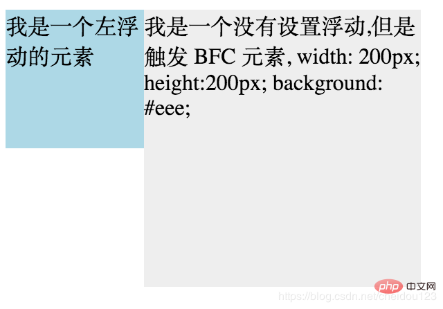
这时候其实第二个元素有部分被浮动元素所覆盖,(但是文本信息不会被浮动元素所覆盖) 如果想避免元素被覆盖,可触第二个元素的 BFC 特性,
在第二个元素中加入 overflow: hidden,就会变成:
学习视频分享:css视频教程
以上就是css bfc是什么意思的详细内容!
相关内容
-
css怎么控制按钮不可用
方法:给按钮元素添加“pointer-events:none;”样式来让按钮元素永远不会成为鼠标事件的target,让其点击事件失效,即可控制按钮不可用。本教程操作环境:win...
-
css如何设置一行字显示不完隐藏
css中可利用overflow属性来设置一行字显示不完就隐藏;只需给文字的盒子元素添加“overflow:hidden;”样式,设置当内容溢出元素框时,将文字内容修剪,且溢出部...

-
CSS外链式与内联式的区别是什么
区别:CSS外链式是将css代码单独写一个以“.css”为扩展名的文件中,然后使用link标签链接到html中。CSS内联式是直接使用style属性将css代码写在HTML标签...

-
css有继承关系吗
css有继承关系。CSS继承是一种规则,它允许样式不仅应用于某个特定html标签元素,而且应用于其后代;也就是说:设置了上级(父级)的CSS样式,上级(父级)及以下的子级(下级...
-
浅谈使用CSS实现半透明边框和多重边框效果的方法
本篇文章分两种场景给大家介绍一下CSS实现半透明边框与多重边框效果。有一定的参考价值,有需要的朋友可以参考一下,希望对大家有所帮助。(学习视频分享:css视频教程)场景一:实现...

-
css实现领积分动画效果
最近项目中要做一个领积分的效果,根据老板的描述,这个效果类似于支付宝蚂蚁森林里的领取能量。整体效果是就是在树周围飘着几个积分元素,上下滑动,类似星星闪烁,点击领取后,沿着树中心...

-
CSS %单位的特点
CSS%单位的特点:1、百分比是一个相对长度单位,相对于父元素的尺寸;2、对于“position:absolute;”的元素是相对于已定位的父元素;3、对于“position:...
-
使用CSS实现的几种进度条
(学习视频分享:css视频教程)进度条是一个非常常见的功能,实现起来也不难,一般我们都会用div来实现。作为一个这么常见的需求,whatwg肯定是不会没有原生组件提供(虽然有我...

-
如何用css把图片弄成背景
用css把图片弄成背景的方法:首先创建一个HTML示例文件;然后在body中添加一些p标签;最后使用css中的background属性将图片设置为背景即可。本教程操作环境:Wi...

-
css里面怎么让body内容居中
css里面让body内容居中的方法:1、使用margin设置边距“0auto”让HTML页面中所有的元素水平居中;2、将div距离页面窗口左边框和上边框的距离设置为“50%”;...