使用CSS3实现简单时间轴效果(附代码)
本篇文章分享一个使用CSS3实现的时间轴效果。有一定的参考价值,有需要的朋友可以参考一下,希望对大家有所帮助。

【推荐教程:CSS视频教程 】
最近打开电脑就能看到一个实战路径图页面,效果是这样的:

有点像时间轴的赶脚,而且每一块鼠标悬浮上去也有下拉效果展开介绍截图信息,就感觉效果还不错。但感觉这种效果貌似对于动态添加不是很灵活,因为高度不像宽度可以灵活的自适应,故添加得自己一个一个设置。所以很多都是做成展示效果。
当然啦,自己也基于它的这个想法搞了一点简单点的类似效果,主要还是整个布局效果,具体每一块内容就不仿造了,而且我自己也加了一下开场动画,让它更好玩一些…
先来看看效果吧:
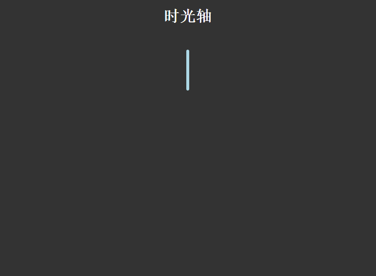
大概效果就是这样啦,下来废话不说,还是直接进入主题:
HTML结构:
<div class="timezone">
            <div class="time">
                <h2>2015-07-02</h2>
                <div>
                    <p>暴走大事件第一季</p>
                    <ul>

                    </ul>
                </div>
            </div>
            <div class="timeLeft" style="top: 100px;">
                <h2>2015-07-02</h2>
                <div>
                    <p>暴走大事件第二季</p>
                    <ul>

                    </ul>
                </div>
</div>
这里简化了一下HTML结构,.time类表示在右边,.timeLeft表示在左边,然后加点上外边距就可以了,每一块里面的内容我就删减掉了。
CSS样式代码如下:
body{
                background: #333;
            }
            h1{
                text-align: center;
                color:#fff;
            }
            .timezone{
                width:6px;
                height: 350px;
                background: lightblue;
                margin: 0 auto;
                margin-top:50px;
                border-radius: 3px;
                position: relative;
                -webkit-animation: heightSlide 2s linear;
            }
            @-webkit-keyframes heightSlide{
                0%{
                    height: 0;
                }
                100%{
                    height: 350px;
                }
            }
            .timezone:after{
                content: '未完待续...';
                width: 100px;
                color:#fff;
                position: absolute;
                margin-left: -35px;
                bottom: -30px;
                -webkit-animation: showIn 4s ease;
            }
            .timezone .time,.timezone .timeLeft{
                position: absolute;
                margin-left: -10px;
                margin-top:-10px;
                width:20px;
                height:20px;
                border-radius: 50%;
                border:4px solid rgba(255,255,255,0.5);
                background: lightblue;
                -webkit-transition: all 0.5s;
                -webkit-animation: showIn ease;
            }
            .timezone .time:nth-child(1){
                -webkit-animation-duration:1s;
            }
            .timezone .timeLeft:nth-child(2){
                -webkit-animation-duration:1.5s;
            }
            .timezone .time:nth-child(3){
                -webkit-animation-duration:2s;
            }
            .timezone .timeLeft:nth-child(4){
                -webkit-animation-duration:2.5s;
            }
            @-webkit-keyframes showIn{
                0%,70%{
                    opacity: 0;
                }
                100%{
                    opacity: 1;
                }
            }
            .timezone .time h2,.timezone .timeLeft h2{
                position: absolute;
                margin-left: -120px;
                margin-top: 3px;
                color:#eee;
                font-size: 14px;
                cursor:pointer;
                -webkit-animation: showIn 3s ease;
            }
            .timezone .timeLeft h2{
                margin-left: 60px;
                width: 100px;
            }
            .timezone .time:hover,.timezone .timeLeft:hover{
                border:4px solid lightblue;
                background: lemonchiffon;
                box-shadow: 0 0 2px 2px rgba(255,255,255,0.4);
            }
            .timezone .time div,.timezone .timeLeft div{
                position: absolute;
                top:50%;
                margin-top: -25px;
                left:50px;
                width: 300px;
                height: 50px;
                background: lightblue;
                border:3px solid #eee;
                border-radius: 10px;
                z-index: 2;
                overflow: hidden;
                cursor:pointer;
                -webkit-animation: showIn 3s ease;
                -webkit-transition: all 0.5s;
            }
            .timezone .timeLeft div{
                left:-337px;
            }
            .timezone .time div:hover,.timezone .timeLeft div:hover{
                height: 170px;
            }
            .timezone .time div p,.timezone .timeLeft div p{
                color: #fff;
                font-weight: bold;
                text-align: center;
            }
            .timezone .time:before,.timezone .timeLeft:before{
                content: '';
                position: absolute;
                top:0px;
                left: 32px;
                width: 0px;
                height: 0px;
                border:10px solid transparent;
                border-right:10px solid #eee;
                z-index:-1;
                -webkit-animation: showIn 3s ease;
            }
            .timezone .timeLeft:before{
                left:-33px;
                border:10px solid transparent;
                border-left:10px solid #eee;
            }
            .timezone .time div ul,.timezone .timeLeft div ul{
                list-style: none;
                width:300px;
                padding:5px 0 0;
                border-top:2px solid #eee;
                color:#fff;
                text-align: center;
            }
            .timezone .time div li,.timezone .timeLeft div li{
                display: inline-block;
                height: 25px;
                line-height: 25px;
            }
此CSS样式代码仅供参考,实用性不是很强,而且同样没有怎么整理过,主要还是理解一下动画效果还有整体布局吧。祝好!
更多编程相关知识,请访问:编程视频!!
以上就是使用CSS3实现简单时间轴效果(附代码)的详细内容!
相关内容
-
为什么grid-gap会导致溢出?
您有一个3列网格容器(.body):grid-template-columns:25%50%25%这些列的总宽度为100%。然后在列(和行)之间添加沟槽:grid-gap:10...
-
css3给背景图层加颜色遮罩的方法
(学习视频分享:css视频教程)在开发中,有时遇到需要给背景层加颜色遮罩的项目,现在特定总结一下给背景图层加颜色遮罩的方法。方法一:通过定位叠加(注意层级)<divcla...
-
使用CSS实现的几种进度条
(学习视频分享:css视频教程)进度条是一个非常常见的功能,实现起来也不难,一般我们都会用div来实现。作为一个这么常见的需求,whatwg肯定是不会没有原生组件提供(虽然有我...

-
CSS3实现文字折纸效果的方法(代码示例)
本篇文章给大家通过示例介绍一下使用CSS3来实现文字折纸效果的方法,有着一定的参考价值,现在分享给大家,有需要的朋友可以参考一下,希望对大家有所帮助。CSS3文字折纸代码如下,...
-
css3字体可以模糊吗
css3字体的可以模糊的;开发者可以使用CSS3中的filter属性来实现字体模糊效果,filter语法是“filter:blur(px);”,其filter属性定义了元素的可...

-
vs2010 如何支持css3
vs2010支持css3的方法:首先下载CSS3IntellisenseSchema并安装;然后用“Win+R”输入“regedit”打开注册表;接着将css30.xml拷贝到...
-
聊聊你可能不了解的CSS属性函数 attr()
本篇文章带大家了解一下CSS属性函数attr()。有一定的参考价值,有需要的朋友可以参考一下,希望对大家有所帮助。属性函数attr()用于获取HTML元素里面的属性值,并用于样...
-
浅谈css3 device-width和width之间的差异
本篇文章和大家谈谈css媒体查询中device-width与width的区别。有一定的参考价值,有需要的朋友可以参考一下,希望对大家有所帮助。【推荐教程:CSS视频教程】1.d...
-
css3怎么设置元素背面不可见
在css3中,可以利用backface-visibility属性,通过给元素添加“backface-visibility:hidden;”样式来设置背面不可见。backface...

-
详细了解CSS3中的border-image-slice属性
【推荐教程:CSS视频教程】首先我们来了解一下它是干嘛的。说明:文档说明:它是控制图像边界向内偏移的。what???这是嘛意思啊?根本看不懂!!!好的,我们先不要急,我们在看看...